Gift Set Collection
Brand/Product Packaging
Converse Captivation
Deliverables
Product Packaging
Gift Set Packaging
Objective
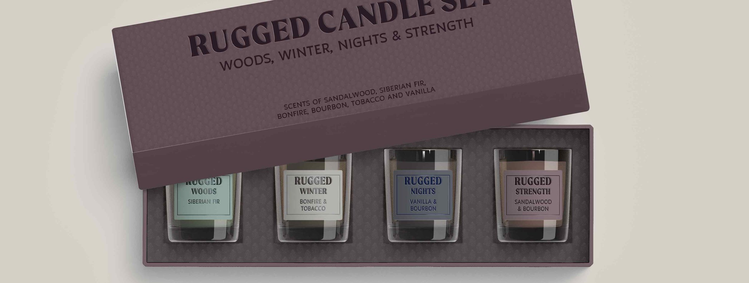
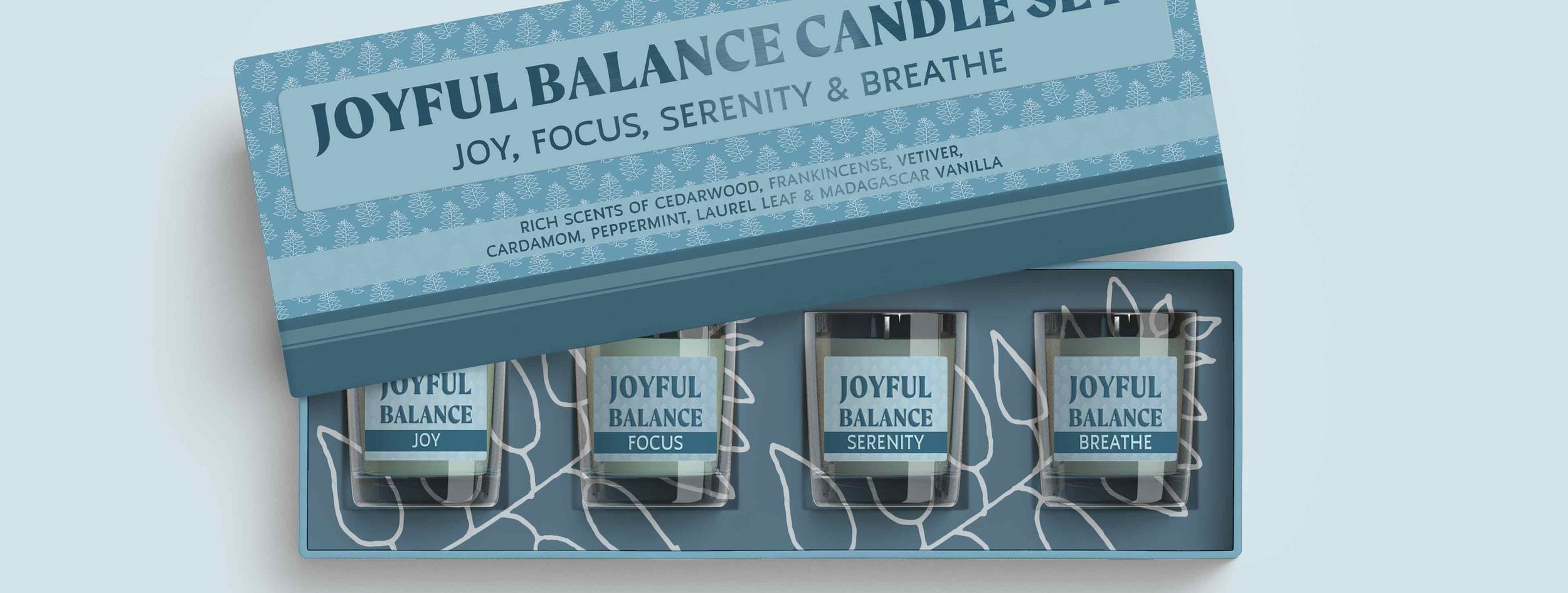
The objective for this project was to create packaging for two styles of gift sets, one masculine and one feminine, using the same pattern.


Concept
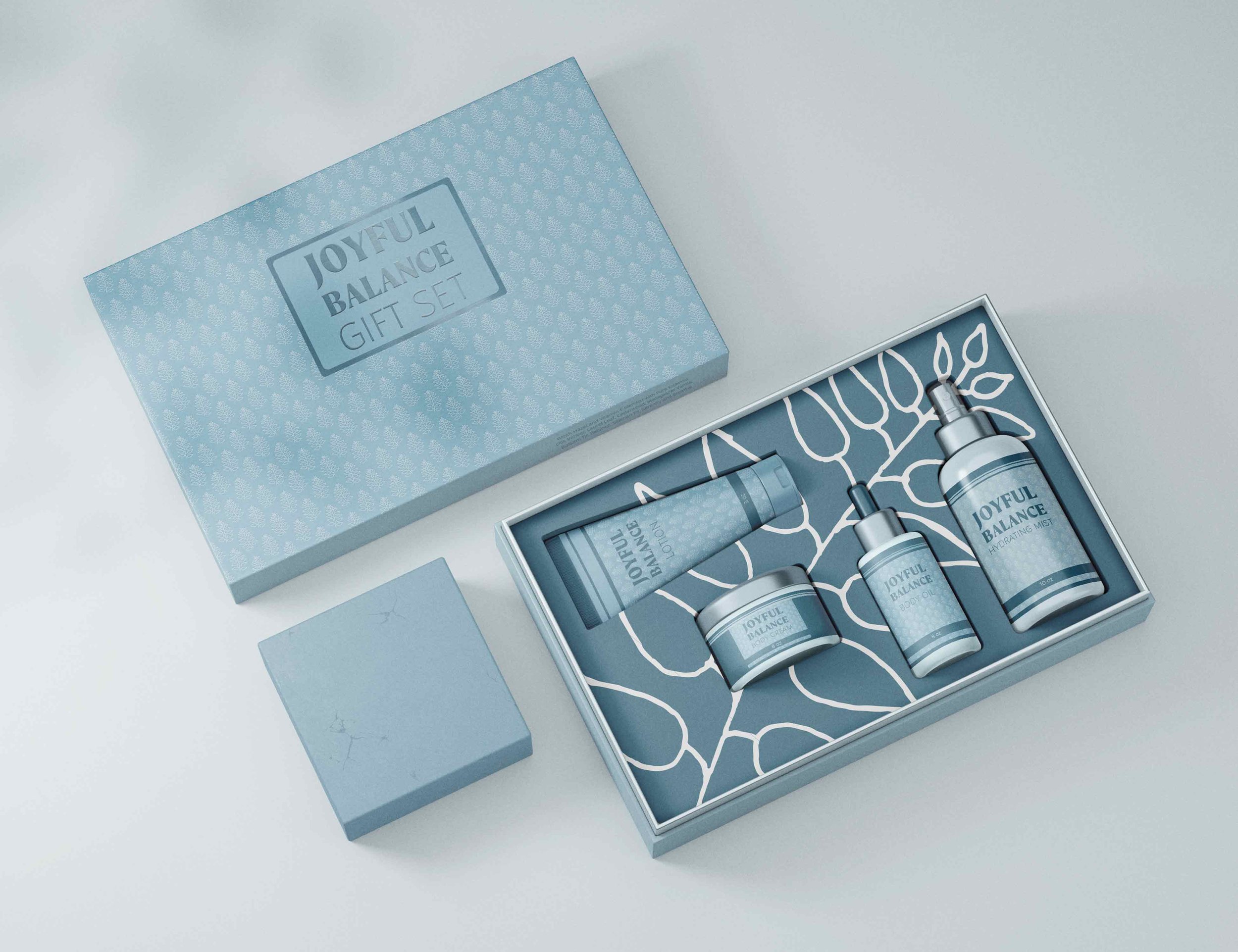
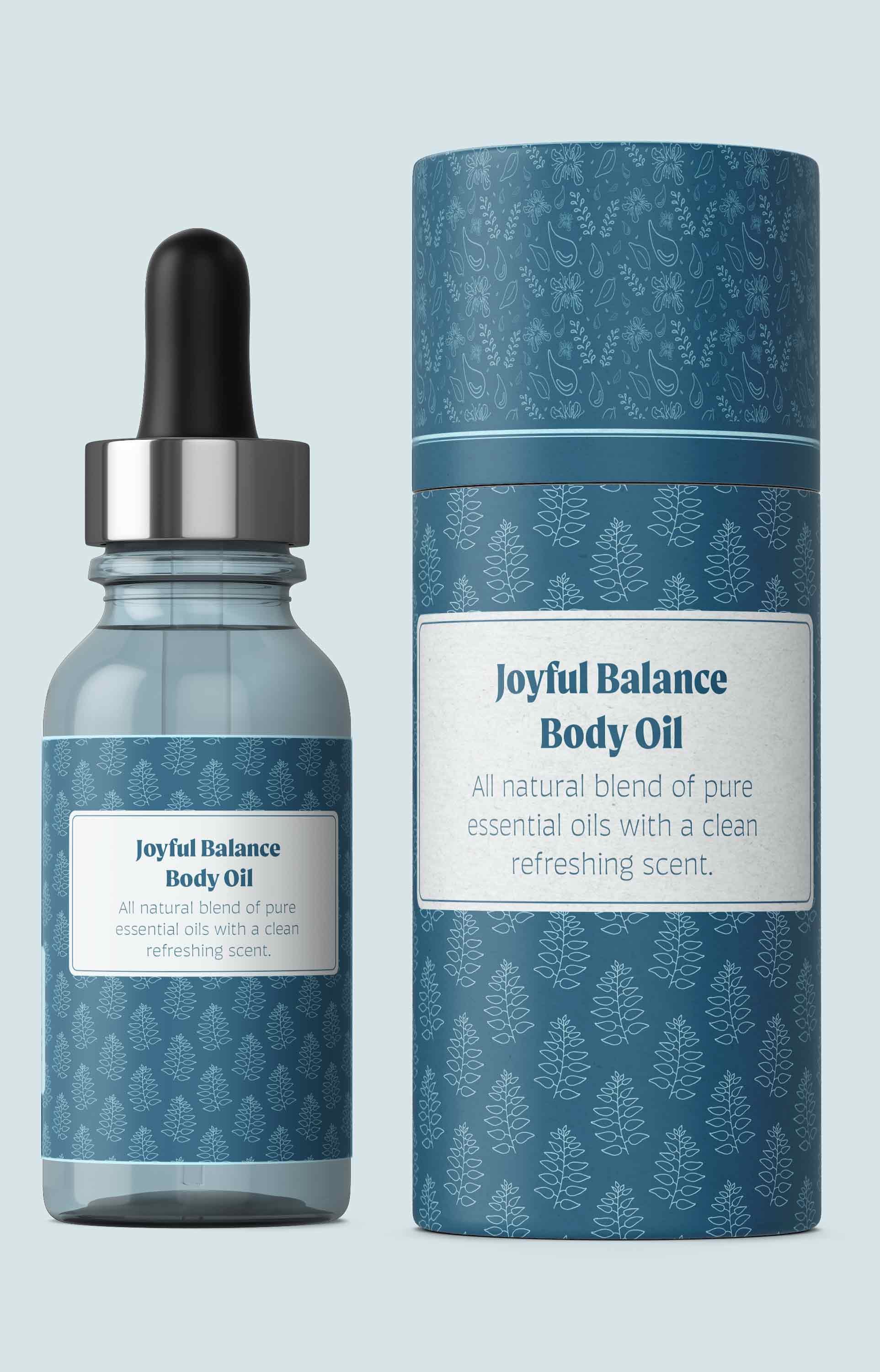
The concept for this project was to approach the design with a fresh and airy style. The use of the pattern wasn’t to weigh down the package but provide texture and interest that would allow for a company to deploy the packaging with a wide variety of products.
By using an illustration of a twig with several leaves that still has the hand of the artist there is the feel of freshness and nature. The blue-greens with the more contrasting pattern of the feminine package along with the large twig image internally feels fresh and joyful. The more masculine package is a deep red-violet to evoke deep roots and earthiness. By using the pattern on this package with less contrast it becomes more textural. Both packages have a metallic embossed name to provide additional interest and contrast with the more subdued matte finish of the remainer of the box.
